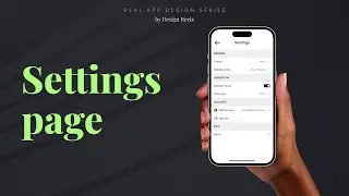
Settings Page UI design tutorial in figma
#figmatutorial #settings #uidesign
Settings Page UI design tutorial in Figma
In this tutorial, I will be showing you how you can design a settings page in Figma.
Start by creating a new file in Figma and setting the correct dimensions for your design (e.g. for mobile, you may want to use 375x812 pixels).
Create a new frame to serve as the container for your settings page. This frame should be divided into sections to organize the different settings options.
Start by creating a header section, where you can include the title of the page, a back button, and any other relevant elements.
Create a section for each group of settings options. Each section should have a clear title and a consistent layout.
Within each section, create individual components for each setting option. This could be a toggle switch, a drop-down menu, or a text input field, depending on the type of option.
SUBSCRIBE for more videos!
~~~~~~~~~~~~~~~~~~~~~~~~~~~~~~~~~~
FAQ :
1) Are you working currently?
Yes, I am working full-time as a product designer.
2) Have you done any product design courses online?
Nope, I am a proud self-taught designer.
3) Why you are on youtube?
As a self-taught designer youtube played a major role in my career growth.
Now, I feel confident and I am ready to give back to the community with what I have learned so far in the form of tutorials and videos on the same youtube platform. I hope my content inspires people like me :)







![how i create user flows using miro [full tutorial]](https://pics.providosiki.ru/watch/Ys0XvgIaWTs)
