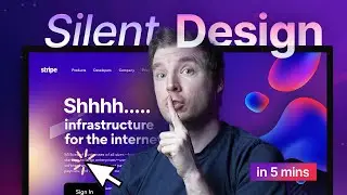
7 Silent UI Hacks That Web Designers Use To Make Better Websites
Web design has a number of hidden trips and tricks that help you build better looking websites. In this video I explore some of the unsaid ways that designer use to build better looking sites. These are things I've learned over the years, some might be general knowledge others not mentioned much, but they are small ways I make my UI / user interfaces just look a bit better.
1. Inspiration Board
2. Unique Font Family
3. Line Height
4. Font Kernelling
5. Picking Colors
6. Color Gradients and Combinations
7. Micro Animations
#ui #website #design
Check out my courses!
📘 Teach Me Design: https://www.enhanceui.com/
📚 OpenAI GPT: https://enhanceui.gumroad.com/
Join my Community!
🟣 Discord: https://adrian-twarog.hopp.to/wix-studio
Software & Discounts!
📦 Admin Templates and UI Kits: https://bit.ly/themeselection15
🖥️ Screen Recorder: https://screenstudio.lemonsqueezy.com?aff=po745
⛌ Wix Studio: https://wix.com/studio/?utm_campaign=...^social&experiment_id=^yt
