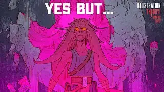
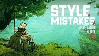
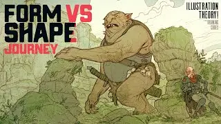
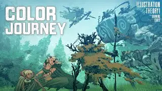
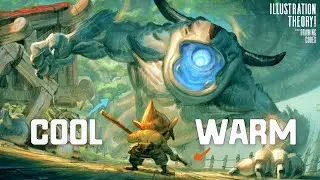
Does Your Art Style Properly Emphasise Form… or Shape?
Check out my Free Illustration Mini Workshop where I share my journey from Amateur to Pro: https://www.thedrawingcodex.com/illus...
You will get some simple advice on how to get more detail and polish in your work. How to think about composition. And my thoughts on how to prepare for professional work.
This is an idea that crosses all forms of Art, Illustration, Cinema, Animation, Video Games, Comics, Etc.
To what degree does lighting and form play a role in your artistic style?
One of the most important aspects of picture making is understanding the difference between form based imagery and shape based imagery.
In this video I look at this concept in depth so you can see how it affects the artistic styles around you!
Below is an Automagically generated summary to help understand the video and aid search optimisation:
----
DESCRIPTION TEXT
Form versus shape is a critical concept in artistic style across cinema, comics, animation, and video games. This video explores how we perceive form and shape, which is foundational in understanding and creating different artistic styles. Form is about structure, anatomy, and the three-dimensional aspects of objects, often highlighted by lighting and tone. Shape, on the other hand, is more iconographic and symbolic, simplifying objects into recognizable icons or cartoons.
Understanding the balance between form and shape is essential for achieving the desired style, mood, and effect in your art. I demonstrate this through examples in Photoshop, comparing images with different focuses on lighting and form versus shape and object-based contrasts.
Lighting plays a significant role in form-based images, where light and shadow define the object's shape. Conversely, shape-based images rely more on color contrast and clear, flat lighting, as seen in cartoony styles like French clean line or works by Wes Anderson. These styles use minimal shadows, emphasizing shapes and features through color and design rather than light and shadow.
This concept also affects storytelling. Horror and suspense genres often use form-based imagery with dramatic lighting to create tension and ambiguity, as seen in Blade Runner and Alien. In contrast, more straightforward narratives, like those in cartoons or certain comic styles, use shape-based imagery for clarity and ease of understanding.
Exploring these contrasts helps artists understand how to manipulate form and shape to suit their stylistic and narrative needs. Different genres and mediums may lean more towards one approach, but blending these techniques can yield unique and effective results.
Understanding these concepts will improve your ability to analyze and create various styles in your art, whether you aim for the symbolic simplicity of cartoons or the nuanced realism of form-based illustrations.
KEY TAKEAWAY POINTS:
FORM VS SHAPE
Form focuses on structure, anatomy, and three-dimensional aspects, often defined by lighting and tone.
Shape is more iconographic and symbolic, simplifying objects into recognizable icons or cartoons.
LIGHTING AND PERCEPTION
Lighting plays a crucial role in form-based images, defining objects through light and shadow.
Shape-based images rely on color contrast and minimal shadows, emphasizing clear, flat lighting.
IMPACT ON STORYTELLING
Form-based imagery with dramatic lighting creates tension and ambiguity, suited for genres like horror and suspense.
Shape-based imagery provides clarity and ease of understanding, ideal for straightforward narratives and cartoons.
APPLICATION IN DIFFERENT MEDIUMS
Cinema, comics, animation, and video games can all benefit from understanding the balance between form and shape.
Blending these techniques can yield unique and effective artistic results.
IMPROVING ARTISTIC SKILLS
Analyzing and applying form and shape concepts helps artists manipulate style and narrative effectively.
These techniques are crucial for achieving desired artistic effects and improving overall skill in various artistic mediums.
----
00:00 Intro
02:30 Welcome
03:13 Form V Shape Basics
06:38 Understanding This Concept in More Depth
16:10 Examples From Different Media and Mediums
29:25 Combining Rendering Styles
36:00 Key TakeAway + Real World Examples
39:47 Out
Happy Drawing!
Tim Mcburnie
Learn Drawing and Illustration from me: www.thedrawingcodex.com
Portfolio: www.timmcburnie.com
www.artstation.com/tim-mcburnie
www.instagram.com/timmcburnie
twitter.com/timmcburnie

![Нормандские острова: Вторая мировая война. Оккупация. Как это было? [35 серия]](https://pics.providosiki.ru/watch/2pWhJws07d4)


