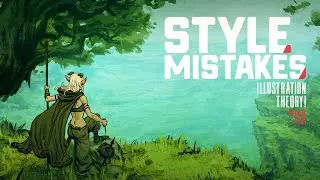
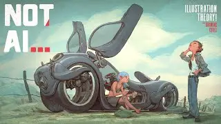
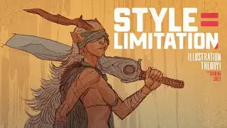
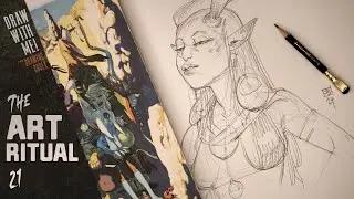
How I Finally Decided Between Painted vs ComicBook Style.
Check out my Free Line and Color Quick Start Guide: https://www.thedrawingcodex.com/quick... You will learn how to develop a simple reliable process in photoshop. You also get all the brushes and PSDs that I use in the guide (the same ones I use for most of my illustrations).
Lets discuss Art Style!
In the beginning, even though I had a style... I didn't really know how it worked.
When I got feedback it was hard to know how to apply some of the things people were suggesting.
Often when I needed to increase contrast or impact or to make the image feel a different way... the road forward is unclear.
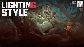
I think understanding how Style and Lighting interact, especially when it comes to rendering form vs leaving things less rendered (and thus focusing on shape) is a key component of Style.
It took me a long time to figure this stuff out. This video talks about my journey and struggles to get better and understand how my style really worked.
Here are some Automagically generated takeaways to help with search optimisation:
----
Early on. I was torn between painted realistic styles, and cartoony comic book styles I wasn't sure if I wanted to make things realistic or exaggerated.
A major part of this was not understanding how to leverage form versus shape. I wasn’t ever really shot how to get the looks I wanted, and I didn’t know how the style I had chosen really worked.
The concepts of painted style, comic book style, realism, and 'cartooniness' are often intermingled. But there are key differences in the way we represent the world which can drastically effect how our art looks. Often these are less about realism or ‘rendering’ and more to do with how we think about how lighting effects our art… be it in film, or comics, or video games.
Also… in the beginning, our style is often limited by our technical ability. We often choose a style based on what seems easy or achievable at the moment. There's also a tendency to value certain styles more because they appear more technically challenging. I used to think a rendered or painted style was better and more valuable.
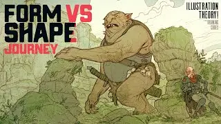
One concept that helped me understand these different elements of style is form versus shape. In this video, I share my journey of mastering different aspects of creating images in comics, illustration, and concept art. By sharing my journey, I hope you can understand how these concepts might apply to your style.
KEY TAKEAWAY POINTS
1. FORM VS SHAPE
Form focuses on structure, anatomy, and three-dimensional aspects defined by lighting.
Shape is more iconographic and symbolic, simplifying objects into recognizable icons.
2. IMPACT OF TECHNICAL ABILITY
Initial style choices are often limited by technical skills.
We tend to value styles that seem more technically challenging.
3. UNDERSTANDING FORM & SHAPE GIVES YOU FREEDOM
Figuring out how to get the look you want is easier if you can tease out these different elements of style.
More technical ability will also give you more options when it comes to expressing yourself.
----
00:00 Intro
02:41 Welcome
03:24 Basic Concept of Form Vs Shape
06:08 Early on...
13:49 Problems With Not Having Style Sorted!
16:04 Progression And Combining Painted Styles With Comicbook Styles
18:21 Better Technical Foundation Can Influence Style
27:39 Going Back To Shape Focused Designs
30:35 Clean Line Style (Focusing on Flat Color Design in Comics)
32:49 Advantages of Cartoony Styles
34:10 Final Thoughts!
37:03 Out!
Happy Drawing!
Tim Mcburnie
Learn Drawing and Illustration from me: www.thedrawingcodex.com
Portfolio: www.timmcburnie.com
www.artstation.com/tim-mcburnie
www.instagram.com/timmcburnie
twitter.com/timmcburnie
