Mastering Color Contrast Upgraded My Art Style!
Check out my Free Line and Color Quick Start Guide: https://www.thedrawingcodex.com/quick... You will learn how to develop a simple reliable process in photoshop. You also get all the brushes and PSDs that I use in the guide (the same ones I use for most of my illustrations).
Here are some Automagically generated takeaways to help with search optimisation:
----
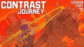
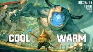
Knowing how to infuse your art, illustrations, or images with contrast, punch, and energy is a significant challenge in art. Understanding the difference between tonal and color contrast has been instrumental for me, and not grasping these concepts can lead to considerable artistic frustration. This was certainly true for me, especially when relating these ideas to the development of a unique artistic style. My journey to comprehend tonal versus color contrast wasn't straightforward. It took a long time to understand how these principles affected picture-making and my style, allowing me to evolve and diversify my approaches for different projects.
In this video, I want to share that journey, exploring how the concept of tonal versus color contrast has influenced my style, the pitfalls I encountered, and the immense frustrations I faced when I couldn't achieve the look I wanted in my art. Through this, I hope to help you avoid the traps I fell into and aid your understanding of how this applies to your artistic style.
First, I'll give an overview of my journey and some challenges I encountered. Initially, I was often confused about whether to focus on painting or line art, a common dilemma early in an artist's journey. This led me to become proficient in creating art that was more monotone, using very simple image plans. I became skilled at creating darker characters on lighter backgrounds, essentially working with simple silhouettes, which significantly influenced my style.
The key for me was tonality—using black, white, dark, and light to define contrast, which was my initial step in learning image creation. Many advised that understanding how to make art work in black and white was crucial, and I took this to heart.
This journey of understanding color and tonality, improving my comic drawing, and enhancing my overall skills brought many improvements, but I still found it difficult to create work in a more simple colorful style (something I wanted to use to fit particular projects I had in mind). I oscillated between cartoony, flat styles and more rendered, realistic styles, trying to find the right balance of tonal contrast to give my images the necessary impact.
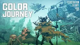
A breakthrough came when I started to explore flat color use, inspired by my fondness for Tintin, Asterix, and the clean line French style comics I grew up with.
----
00:00 Intro
02:20 Welcome
03:03 Overview Of My Art Journey
09:06 Early Work - Characters & Silhouettes
17:34 My First Job - Pirates!
19:18 Working From Other People's Image Plans
22:33 How The Scene Choice Can Help You
26:38 My Evolution and Stylistic Solutions
32:35 Wanting To Explore Different Styles
36:12 Going Deeper into Flat Color And Color Contrast
43:04 Final Thoughts
Happy Drawing!
Tim Mcburnie
Learn Drawing and Illustration from me: www.thedrawingcodex.com
Portfolio: www.timmcburnie.com
www.artstation.com/tim-mcburnie
www.instagram.com/timmcburnie
twitter.com/timmcburnie
