How I Learned To Combine Color Theory With Color Intuition...
Check out my Free Illustration Mini Workshop where I share my journey from Amateur to Pro: https://www.thedrawingcodex.com/illus...
You will get some simple advice on how to get more detail and polish in your work. How to think about composition. And my thoughts on how to prepare for professional work.
One of the hardest things I was faced with early on was designing different color schemes. I had some that worked but was often at a loss for how to make some scenes interesting.
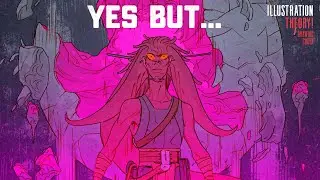
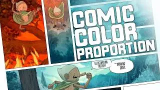
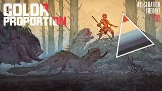
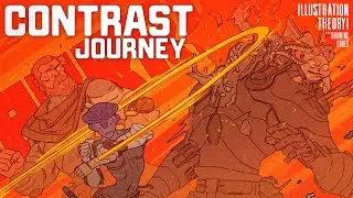
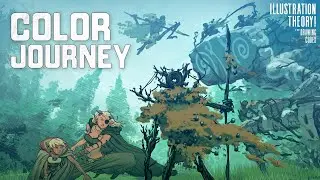
One of the 'Theory' concepts that helped me understand how to handle comic pages was actually color proportion. This looks at how often images are made up of a majority of grey muddy nothing... with contrasting or complementary colors plus an accent or brighter color... and that it's pretty easy to think about the actual percentages of each color or set of colors that are used.
It's useful to visualise this as a triangle or pyramid of color. At the base is the foundational majority of the image... and at the top are the accent colors that are often used as part of the focal area.
This is a gross oversimplification, but it has served me well to organise things and figure out why images I liked worked.
In this video I talk about my journey to understanding and applying this better in some of my Comicbook work.
Below is an Automagically generated summary to help understand the video and aid search optimisation:
----
In this video, I explore the challenge of balancing intuition and theory in creating better images. I delve into the concept of color proportion, visualized as a pyramid, and how it has influenced my work in comic book art. This video covers my journey from relying on intuition to understanding and applying color theory in professional projects like comic books. We'll discuss the importance of vibrant accent colors against neutral tones and how this balance creates visually appealing images. I'll share insights and practical tips on planning and using color proportion in comic book pages to enhance storytelling and visual impact.
----
00:00 Intro
02:19 Welcome
03:02 Theory Vs Intuition
05:51 A Quick Overview Of Color Proportion
08:08 The Blessing And Curse Of Good Intuition...
21:03 Who Is Truely In Control Of What Goes Where?
27:35 Color Proportion Is King! (Along With A Bunch Of Other Stuff!)
34:16 Out!
Happy Drawing!
Tim Mcburnie
Learn Drawing and Illustration from me: www.thedrawingcodex.com
Portfolio: www.timmcburnie.com
www.artstation.com/tim-mcburnie
www.instagram.com/timmcburnie
twitter.com/timmcburnie


![Нормандские острова: Вторая мировая война. Оккупация. Как это было? [35 серия]](https://pics.providosiki.ru/watch/2pWhJws07d4)


